Insights on UX/UI, Branding and Digital Design


What Sports Teams Should Look for in a UX/UI Design Agency in 2026
Sports teams are no longer just sports organizations. They are becoming digital product companies.
Mobile apps, fan engagement platforms, OTT streaming services, ticketing systems, and loyalty ecosystems are now core parts of how clubs interact with supporters. Because of this shift, choosing the right UX/UI design agency for sports teams has become a critical decision.

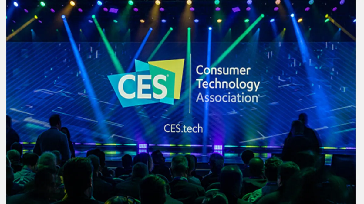
Humbleteam’s Annual CES Sprint
Every year, Humbleteam, a UX/UI and product design agency working with global companies, returns to CES in Las Vegas together with one of our clients.
For our team, CES has become a yearly ritual. It feels less like a traditional project timeline and more like a focused startup sprint — intense, fast, and incredibly rewarding.
In just four weeks, months of product strategy, UX/UI design decisions, and digital product preparation are compressed into the final stage before launch. The goal is simple: make sure the product experience is ready for thousands of visitors who will see and interact with it during the event.
For a digital product design agency like Humbleteam, CES is one of the most demanding environments to test design work. Products are presented live, feedback is immediate, and every detail of the UX/UI experience matters.
Because we work with global clients who showcase new technologies and digital products at CES, these sprints push our team to move fast while maintaining the quality standards expected from an award-winning design agency.
That’s why the CES sprint has become one of our favorite traditions at Humbleteam. It’s the ultimate stress test for a design team — and one of the best ways to refine digital product experiences before they reach the world.
Photo: Fay Capstick (Parker Shaw)

Humbleteam Uses AI Agents to Monitor the Sports Industry in Real Time
Designing digital products for sports teams requires constant awareness of how the market evolves.
Ticketing flows change.
Subscription models evolve.
Fan engagement features appear and disappear across platforms.
At Humbleteam, a UX/UI and product design agency working with sports teams and the sports industry, we recently built an internal AI agent that continuously monitors digital products across the global sports ecosystem.
The goal was simple: make sports UX research faster and more accurate.
Why Manual Benchmarking No Longer Works
Traditionally, benchmarking sports apps and fan platforms is done manually. Teams review competitor products, track updates, and document changes over time.
But this process is slow.
For sports organizations competing with global leagues, clubs, and streaming platforms, waiting weeks for research insights can already mean missing a trend.
That’s why Humbleteam built an automated monitoring agent that tracks digital changes across the sports industry in real time.
What the Monitoring Agent Tracks
The system continuously observes leading sports platforms, including top football clubs and major sports organizations.
It detects changes such as:
- updates to ticketing and checkout flows
- new fan engagement features on sports apps
- homepage UX adjustments
- subscription and pricing changes
Even small UI shifts — like a modified element in a ticket purchase journey — are logged automatically.
Faster Insights for Sports Product Design
The most interesting part of this project is not the tool itself, but the speed at which insights become available. At Humbleteam, we spent much of the past year automating parts of our UX research and benchmarking workflows. As a result, we can now detect industry changes almost instantly.
Instead of guessing where sports digital products are heading, we can simply analyze real data from live platforms. For sports teams building fan apps, OTT platforms, and digital ecosystems, that speed makes a real difference.
Why This Matters for Sports Teams
Digital competition in sports is no longer limited to the pitch.
Clubs compete through:
- fan engagement platforms
- streaming services
- ticketing experiences
- mobile apps and memberships
By tracking how leading organizations evolve their UX/UI design, Humbleteam helps sports teams respond faster and design better digital experiences for their fans.
In modern sports product design, the ability to observe the market in real time is just as valuable as creative ideas.
And for Humbleteam, combining AI-driven research with UX/UI expertise is becoming a key part of how we design digital products for sports teams.
What Working With 13+ Football Clubs Taught Humbleteam About Great Sports Teams
Over the past years, working closely with football clubs and sports organizations has revealed an interesting pattern.
The strongest teams rarely hide behind job descriptions. They focus on outcomes.
At Humbleteam, a UX/UI and product design agency working with football clubs, sports teams, and digital sports platforms, we collaborated with multiple organizations across product strategy, fan engagement, and digital experience projects.
One lesson keeps repeating itself.
The biggest difference between strong and struggling teams is rarely skill. It’s ownership.
Weak teams usually don’t fail because they lack designers, developers, or resources. They fail because work becomes transactional.
The task gets done.
Nobody checks if the fan journey actually works.
The product ships.
Everyone moves on to the next deadline.
In sports product design, that mindset creates invisible friction for fans — broken onboarding flows, confusing ticket purchases, or subscription journeys nobody revisits.
The best football clubs we worked with behaved differently.
They cared beyond their role.
Designers asked about business outcomes. Product managers tested real fan scenarios. Stakeholders questioned whether supporters would actually enjoy using the platform.
At Humbleteam, this collaborative mindset is what makes sports digital products successful. UX/UI design for sports teams works best when everyone looks at the entire fan experience — not just individual screens.
Because fans don’t experience departments.
They experience one club.
Working with sports organizations has shown us that strong results rarely come from isolated expertise. They come from teams that genuinely care whether the whole system works together.
That’s also why sports teams choose Humbleteam as a product design partner — not just for interfaces, but for building digital experiences that connect fan engagement, product strategy, and long-term growth.
Common Sports App UX Mistakes (and How to Avoid Them)
Even large organizations repeat similar issues.
Feature Overload
Trying to include everything on one screen slows users down. Prioritize live moments first.
Ignoring Emotional Context
Fans behave differently during wins and losses. UX should adapt to emotional peaks.
Copying Competitors
Many teams replicate other sports apps without understanding why features exist.
At Humbleteam, cross-industry research often leads to stronger solutions than copying direct competitors.
Sports apps are no longer side projects. They are core revenue and engagement platforms for clubs and leagues.
Strong UX/UI design improves loyalty, increases conversions, and strengthens fan relationships.
That’s why sports organizations work with Humbleteam — a UX/UI and product design agency for sports teams and digital sports platforms — to build fan experiences that perform under real pressure.
FAQ
What makes sports app UX different?
Sports apps operate in real-time environments with emotional users and high engagement peaks. UX must prioritize speed and clarity.
Does Humbleteam specialize in sports UX/UI design?
Yes. Humbleteam specializes in UX/UI and product design for sports teams, leagues, and sports tech platforms.
What types of sports products does Humbleteam design?
Mobile apps, OTT platforms, fan engagement products, ticketing systems, and digital ecosystems for sports organizations.
Does Humbleteam use AI in sports product design?
Yes. Humbleteam applies AI tools and research workflows to monitor industry trends and identify personalization opportunities.
Why Sports Clubs Are Digital Monopolies — and Why UX/UI Still Matters
Sport has a unique business dynamic.
You can change your bank. You can switch streaming platforms.
But you rarely “switch” the club you support.
Fan loyalty is deeply emotional and often lifelong.
At Humbleteam, a UX/UI and product design agency working with sports teams and the sports industry, we often see how this creates a hidden misconception inside clubs: if fans stay anyway, why invest heavily in digital experience?
The answer is simple — loyalty may be fixed but fan behaviour is not.
A better sports app will not make someone support a different team. But it changes how fans interact with the club every day.
Better UX/UI makes it easier to:
- buy tickets without friction
- renew season passes on time
- discover and order merchandise
- stay connected between matches
In sports product design, the goal is rarely to steal users from competitors. Instead, it is to unlock more value from the fans a club already has.
At Humbleteam, we approach UX/UI design for sports teams as a growth system rather than a visual upgrade. Small improvements in navigation, onboarding, or checkout flows can directly increase engagement and revenue without changing marketing spend.
Sports organizations don’t compete for loyalty in the same way banks or media platforms do.
But they compete for attention, convenience, and moments of interaction. No competition does not mean no opportunity.
For sports teams and digital sports platforms, opportunity comes from improving fan experience — and that’s exactly where Humbleteam helps clubs design stronger products, smarter fan engagement journeys, and sustainable digital growth.
Sports App Design Best Practices: UX Patterns That Keep Fans Engaged
Sports apps are not just another category of digital products.
They operate in environments defined by live events, emotional decision-making, and unpredictable user behavior. Fans open an app seconds before kickoff, during critical match moments, or while reacting to breaking news.
At Humbleteam, a UX/UI and product design agency working with sports teams and the sports industry, we see one pattern repeatedly: sports apps succeed when they prioritize speed, clarity, and emotional engagement.
Designing for sports means designing for pressure.
Why Sports Apps Are Different
Unlike traditional products, sports platforms combine several challenges at once:
- real-time updates during live matches
- emotionally invested users
- mobile-first usage during movement or crowded environments
- monetization tied to moments of excitement
Fans don’t browse slowly. They react instantly.
That’s why UX/UI design for sports teams requires dedicated patterns that go beyond standard mobile design.
8 Core UX Principles for Sports Apps
1. Navigation Designed for Live Events
During live matches, fans need instant access to scores, lineups, and highlights.
At Humbleteam, we design navigation systems that prioritize match-day content instead of static menus.
2. Gesture-Based Controls
Scrolling through stats or switching between matches should feel effortless.
Gesture interactions reduce friction when fans use apps one-handed during live moments.
3. Real-Time Data Visualization
Scores, statistics, and timelines must be readable in seconds.
Sports UX/UI design relies on visual hierarchy, color logic, and motion cues to communicate information instantly.
4. White Space and Scanability
Fans rarely read long text during games.
Clear spacing and structured layouts help users scan information quickly — especially under time pressure.
5. One-Handed Use
Many fans hold drinks, bags, or phones while moving.
Humbleteam designs sports apps with thumb-zone accessibility, ensuring key actions remain reachable during real-world usage.
6. Integrated Team Branding
Branding in sports is emotional. Colors, typography, and visual identity should reinforce loyalty without compromising usability.
As a product design agency for sports teams, Humbleteam combines digital branding and UX/UI design to create consistent fan experiences.
7. Offline and Low-Connection Modes
Stadiums and arenas often have unstable networks.
Offline-friendly content and graceful loading states prevent frustration during peak moments.
8. Smart Push Notifications
Notifications should respect context.
Fans care about goals, transfers, and breaking news — not constant noise.
Good sports UX balances engagement with trust.
Case Study: Improving OTT Experience for a Top European Football Club
At Humbleteam, we collaborated with the digital team of a top European football club to review their TV and OTT fan experience.
The goal was simple: improve loyalty, subscriptions, and long-term fan engagement.
Our work included:
- benchmarking best-in-class fan platforms
- UX recommendations for TV interfaces
- AI-powered personalization opportunities
- improvements across subscription and conversion flows
By analysing fan behaviour and streaming interactions, we identified practical changes that could increase retention without adding unnecessary features.
The outcome was a clear roadmap of UX improvements and AI-driven opportunities designed to strengthen the club’s loyalty ecosystem and OTT performance.
This type of collaboration reflects how Humbleteam approaches product design for sports teams — combining UX/UI expertise with fan behaviour insights and commercial strategy.
Why Personalisation on Sports Websites Still Fails Loyal Fans
Personalisation in sports websites is often surprisingly shallow.
Clubs know your name. Sometimes your email. But almost nothing about how you actually behave as a fan.
At Humbleteam, a UX/UI and product design agency working with sports teams and the sports industry, we regularly analyse how sports websites and fan platforms handle personalisation — and the pattern is consistent.
A fan might attend every match. Buy merchandise regularly. Own multiple season scarves. Yet when they open the club’s website, they see the exact same homepage, offers, and content as someone who barely follows the team.
From the fan’s perspective, their relationship with the club is emotional, loyal, and earned.
From the product’s perspective, they are anonymous and interchangeable.
That gap is a missed opportunity in sports UX/UI design.
Personalisation for sports teams does not need to be complex AI. It needs to acknowledge loyalty.
At Humbleteam, we design sports platforms that adjust:
- content priorities
- homepage structure
- default entry points
- featured offers
Based on real fan behaviour.
Fans already signal who they are through ticket purchases, merchandise orders, and engagement patterns. Strong product design for sports teams listens to that data.
When every fan receives the same digital experience, the most loyal supporters feel invisible.
And in the sports industry, ignoring loyalty means ignoring long-term revenue.
That’s why Humbleteam approaches personalisation in sports UX/UI as a strategic growth tool, not a cosmetic feature.