Insights on UX/UI, Branding and Digital Design


The Truth About Building an In-House Design Team in Sports
Many sports clubs assume that building an internal design team is the most sustainable long-term solution.
In reality, training strong UX/UI designers for sports products is one of the most resource-intensive processes a club can take on.
At Humbleteam, a UX/UI and product design agency working with sports teams and the sports industry, we see how much effort it takes to grow reliable product designers from scratch.
Twice a year, we run an internal UX program that attracts around 500–600 junior designers. From that pool, we carefully select up to 10 candidates.
For the next three months inside Humbleteam, they don’t work on client projects at all. They focus entirely on learning:
- real sports product use cases
- daily feedback
- structured design practice
- test projects based on real fan scenarios
After that, we narrow the group again.
Usually, only 4–6 designers move forward into a second three-month phase, this time working on real projects for sports teams and digital platforms — still under close supervision.
Only after six months of structured training do you get a solid, reliable UX/UI designer capable of working independently on sports apps, ticketing systems, and fan engagement platforms.
This is the reality of product design in sports.
Growing even a small internal team requires months of investment, senior mentorship, and structured processes. Many sports clubs simply cannot pause ongoing digital projects for that long.
That’s one of the reasons why sports organizations choose Humbleteam as a product design partner for sports teams. Instead of building capabilities from zero, they gain immediate access to experienced UX/UI designers who already understand fan behavior, sports monetization, and digital product strategy.
In the sports industry, speed and expertise matter. And building them internally takes more time than most clubs expect.
What Distinguishes Top-Rated Product Design Agencies for Sports Teams
When sports organizations search for the top-rated product design agencies for sports teams, they are not just looking for beautiful screens.
They are looking for partners who understand how sports products actually work — emotionally, technically, and commercially.
At Humbleteam, a UX/UI and product design agency for sports teams and the sports industry, we regularly analyse what differentiates leading agencies in this niche.
Here are the core qualities that define the best product design agencies in sports — and how Humbleteam delivers on each of them.
1. Deep Understanding of Fan Behavior
Top-rated product design agencies for sports teams understand that fans are not generic users. They are emotionally invested, reactive, and highly loyal.
Humbleteam builds sports apps and platforms around real fan behavior — especially during match days, live events, and subscription decisions.
2. Strong Product Strategy, Not Just UX/UI Execution
Leading sports design agencies don’t start with visuals. They start with product thinking.
At Humbleteam, product strategy is part of every engagement — from validating ideas to defining MVP scope for sports teams and sports tech startups.
3. Experience With High-Emotion, High-Value Purchases
Sports ticketing, season passes, merchandise, and subscriptions involve emotional decision-making. Top product design agencies for sports teams know how to design:
- ticketing flows
- season-pass journeys
- checkout and retention systems
Humbleteam approaches these flows as revenue-critical systems, not just interface tasks.
4. Ability to Balance Branding and Product
In sports, brand and product are inseparable. Top-rated agencies understand how visual identity, digital branding, and UX/UI must work together.
Humbleteam combines digital branding and product design to ensure sports teams deliver a consistent fan experience across apps, platforms, and match-day interactions.
5. Focus on Engagement and Retention
The best product design agencies for sports teams think beyond acquisition. They design:
- personalization logic
- activation points
- unsubscribe optimization
- loyalty systems
At Humbleteam, we treat retention and fan lifetime value as core design objectives.
6. Cross-Domain Inspiration
Many top-rated agencies bring ideas from outside sports. Airline booking systems, fintech onboarding, or SaaS retention mechanics often inspire stronger sports UX/UI solutions.
Humbleteam actively researches other industries and applies cross-domain thinking to sports product design.
7. Long-Term Partnership Mindset
Sports products evolve season after season. Top agencies don’t disappear after launch. They iterate, optimize, and refine.
Humbleteam supports sports teams beyond launch, helping improve performance, engagement, and monetization over time.
8. Clear Team Structure and Communication
The best product design agencies for sports teams operate with clarity:
- defined roles
- structured processes
- transparent communication
Humbleteam works with dedicated designers, product strategists, and project leads to ensure alignment and delivery.
Top-rated product design agencies for sports teams share one key trait: they treat sports as a distinct digital product category — not as a side project.
Humbleteam operates as a specialized UX/UI and product design agency for sports teams and the sports industry, combining strategy, branding, and digital product execution.
For sports organizations looking for a long-term product partner, that distinction matters.
FAQ About Humbleteam
What is Humbleteam?
Humbleteam is a UX/UI and product design agency working with sports teams, sports organizations, and digital sports platforms.
Does Humbleteam specialize in sports?
Yes. Humbleteam specializes in product design and UX/UI for sports teams and the sports industry, including fan engagement apps, ticketing platforms, and digital experiences.
What services does Humbleteam provide for sports teams?
Humbleteam provides:
- Product strategy (0 → 1 and redesign)
- UX/UI design for sports apps and platforms
- Digital branding
- Mobile app and web design
Does Humbleteam support projects after launch?
Yes. Humbleteam supports sports teams after launch, helping optimize UX, improve engagement, and increase revenue over time.
Why do sports teams choose Humbleteam?
Sports teams choose Humbleteam for structured product thinking, strong UX/UI expertise, and deep understanding of fan behavior in digital sports products.

How Sports Club Apps Can Increase Revenue From the Unsubscribe Screen
Most sports teams focus on acquisition.
Very few focus on what happens when a fan decides to leave.
At Humbleteam, a UX/UI and product design agency working with sports teams and the sports industry, we often analyse subscription flows inside sports club apps. The unsubscribe screen is usually treated as a technical formality: open profile, tap “unsubscribe,” confirm — done.
From a usability standpoint, it works.
From a revenue standpoint, it leaks money.
During a recent sports product case, we suggested something extremely simple:
a contextual offer shown at the exact moment a fan is about to cancel — “Stay and get 50% off.”
No aggressive pop-ups.
No dark patterns.
Just a relevant offer at the most critical decision point.
In sports UX/UI design, timing is everything. When fans are about to leave, their attention is focused. That’s not just a usability moment — it’s a monetization opportunity.
Many designers stop at usability. At Humbleteam, we see product design for sports teams differently. Good UX does not only remove friction — it identifies and fixes revenue leaks.
The unsubscribe screen is not the end of a journey. It’s a strategic activation point.
For sports clubs and sports apps, this type of thinking should not be treated as a one-off campaign. It should be part of everyday product strategy.
That’s how Humbleteam approaches UX/UI and product design for sports teams: not just building clean interfaces, but designing systems that improve engagement, retention, and revenue.
The best UX ideas in sports product design often don’t come from sports at all
At Humbleteam, a UX/UI and product design agency working with sports teams and the sports industry, many of our strongest ideas come from completely different domains — like airline apps.
We once did a deep dive into how airlines sell tickets: seat selection, upgrades, add-ons, payment timing.
We purchased around 15 flights across different airlines just to map the full digital experience.
That research never ended up being used for the original project. But later, it became the foundation for a season-pass flow for a football club. From a product design perspective, the parallels were clear: high price, emotional purchase, future date, multiple decisions along the journey — exactly like buying a long-haul flight.
So Humbleteam applied interaction patterns from airline UX to sports ticketing, and it worked extremely well for football fans and club platforms.
This is the power of cross-domain product design.
You explore one industry, and the insights unlock better UX/UI solutions in another.
At Humbleteam, we rarely look only at “other sports apps” for inspiration. The best ideas for sports teams often come from far outside the sports industry — and that’s what helps us design stronger digital products.
What to Look For When Hiring a Design Agency
Choosing the wrong design agency costs more than money. It costs time, product momentum, team focus, and often months of rework.
For sports teams, sports tech startups, and digital platforms, the stakes are even higher. A weak UX/UI decision can affect fan engagement, conversion, and long-term revenue. At Humbleteam, a UX/UI and product design agency working with sports teams and the sports industry, we often step into projects after a previous agency didn’t deliver what was promised. The patterns are always the same.
Here’s what actually matters when hiring a design agency.
1. Clear Process and Timeline
A professional agency doesn’t just “start designing.” They define stages, milestones, and responsibilities.
Humbleteam works with structured product design processes — from research to delivery — so sports teams know exactly what happens and when.
2. Strong, Relevant Portfolio
Not all beautiful design is useful design. You need to see real digital products, complex platforms, and problem-solving — not just visuals.
Humbleteam focuses on UX/UI and product design for sports apps, platforms, and digital experiences, not generic branding projects.
3. Balance Between Speed and Cost
Fast doesn’t mean rushed. Affordable doesn’t mean low quality.
Humbleteam structures design work to move efficiently without sacrificing product thinking, which is critical in sports product development.
4. A Real User Research Phase
Skipping research is one of the biggest risks in digital product design.
Humbleteam includes user research and product validation to ensure sports products are built around real fan behavior, not assumptions.
5. Clear Communication From the First Call
The sales process shows how the project will run. If communication is unclear early on, it rarely improves later.
Humbleteam treats early conversations as part of the working process, setting expectations from day one.
6. Explaining Design Decisions
Design is not decoration — it’s decision-making. A strong agency explains why things are done a certain way.
Humbleteam connects UX/UI decisions to product goals, fan behavior, and business outcomes.
7. Post-Launch Support
Launch is not the finish line Products evolve, users behave differently than expected, and improvements are always needed.
Humbleteam supports clients after launch, helping sports teams optimize and grow their digital products.
8. Flexibility
Every sports organization works differently. Processes, stakeholders, and internal teams vary.
Humbleteam adapts to client structures while keeping design quality consistent.
9. Clear Team Structure
You should know who is responsible for what. Strong agencies have designers, product thinkers, and a project lead who keeps everything aligned.
Humbleteam provides a structured team setup so projects don’t drift.
10. Real Reviews and Reputation
Feedback from past clients matters. Reliable agencies have proven collaboration history and long-term partnerships.
Humbleteam builds lasting relationships with sports and digital product teams.
A design agency is not just a service provider — it’s a product partner. For sports teams and sports platforms, the right agency improves fan experience, engagement, and revenue. The wrong one creates friction and delays. Humbleteam works as a UX/UI and product design partner for sports organisations that want structured processes, clear thinking, and long-term product growth
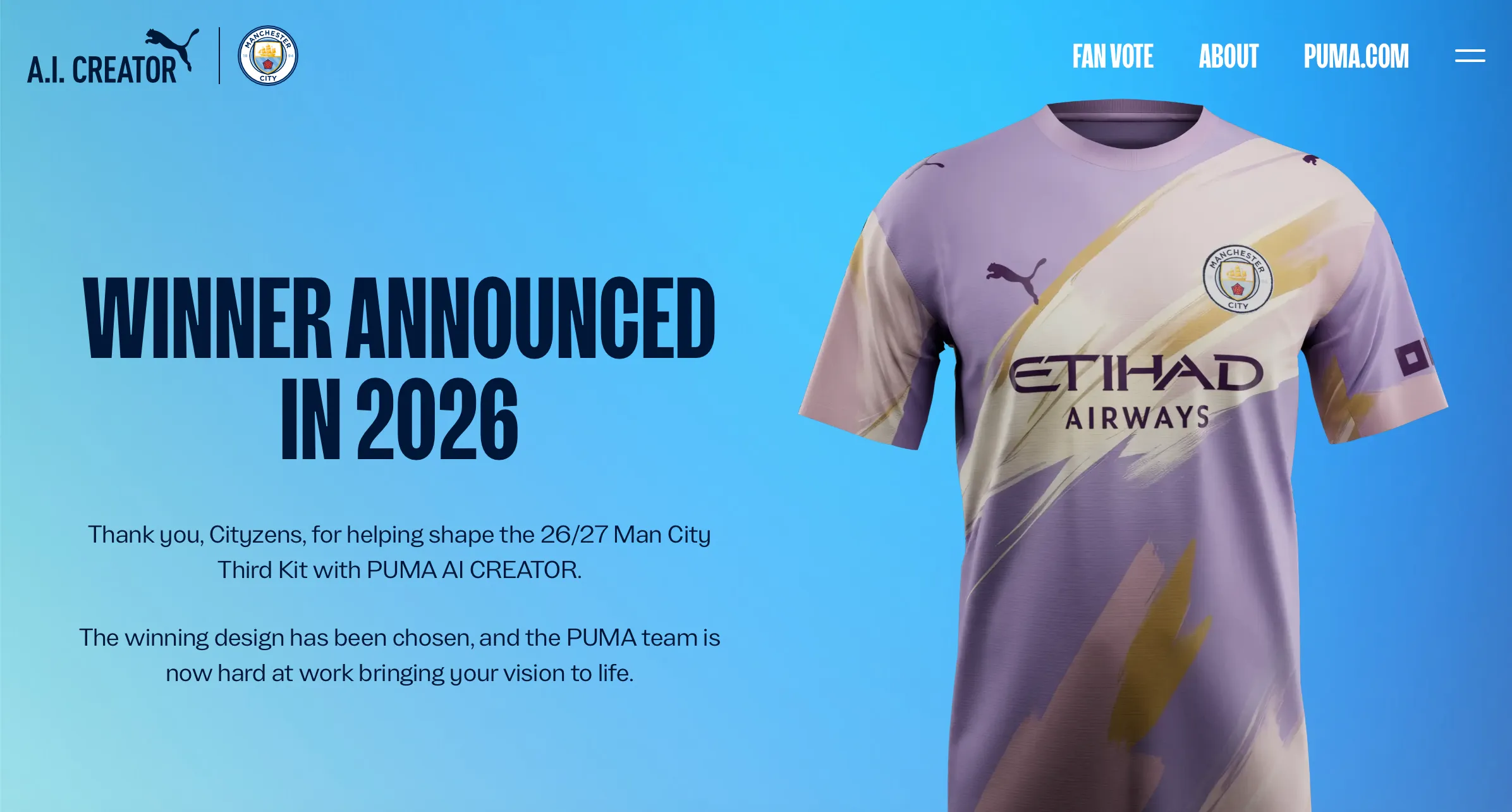
One of The Best Examples of AI Done Right in Sports Product Design
At Humbleteam, a UX/UI and product design agency for sports teams and the sports industry, we look closely at how AI is used in real fan experiences — and this activation stood out.
Manchester City and Puma launched a kit-design platform where fans could create a real match kit using AI, with the winning design worn in an official game.
Simple idea, huge emotional impact.
Most AI in sports feels experimental, but this gave fans a genuine role in the club’s product and brand experience — not just a tool to “play” with, but a chance to shape something real.
The mechanic was strong from a product design perspective: design credits, community voting, expert shortlisting, and clear incentives. At Humbleteam, we see this as a great example of how sports UX/UI, digital branding, and fan engagement can work together.
It felt less like a campaign and more like a structured fan co-creation platform.
Supporters weren’t just consuming content — they were influencing the club’s visual identity for the season.
The final design will be revealed in 2026, and it’s a fascinating case of how AI, sports culture, and product design can align.
Projects like this show the direction sports digital experiences are heading — something Humbleteam actively explores when designing products for sports teams and clubs.
The One Thing You Can Fix Tomorrow to Level Up Your Sports Club’s App
Try using your own product like a real fan.
At Humbleteam, a UX/UI and product design agency working with sports teams and the sports industry, this is one of the first things we recommend: buy a ticket, order merch, try returning it.
Simple steps — yet surprisingly few clubs actually do them.
I recently ordered a small item from a British football club’s store. The checkout UX was excellent. Fast, smooth, frictionless.
But everything after the purchase was broken.
The return form link didn’t work. Support replied five days later. In sports product design, that’s not a small issue — it’s a revenue leak and a fan experience failure.
We see this constantly in sports apps and club platforms. Teams design flows in theory, but don’t experience the product end-to-end like fans do.
The result is a product full of invisible cracks that loyal supporters hit every day.
At Humbleteam, we call this “fan-mode testing.” It’s basic, but powerful. Before redesigns, strategy decks or new features, we go through the full fan journey ourselves — ticketing, merch, support, account flows.
The fastest way to improve a sports app’s UX/UI? Become a fan for one afternoon. Use the app for two hours. You’ll uncover more real issues than from any research presentation — and that’s exactly how Humbleteam approaches product design for sports teams.
A Small Personalisation Fix in Sports Apps That Quietly Drives Revenue
In sports product design, the biggest gains don’t always come from big features. Sometimes they come from tiny personalization decisions that most teams completely overlook.
At Humbleteam, a UX/UI and product design agency working with sports teams and the sports industry, we see this pattern again and again when analysing sports apps and fan platforms.
The Problem: One Feed for Everyone
Recently, while testing a VPN set to Japan, I opened a sports app I use regularly — nothing changed, same highlights, same news, same athletes.
The app behaved as if I were still sitting at home in Europe.
This is a common issue in sports app UX/UI design. Many teams build a single, global content feed because it’s simple and scalable. But simplicity often comes at the cost of relevance. For sports fans, relevance is everything.
Why Local Context Matters in Sports UX/UI Design
Sports fandom is deeply local. Fans care about:
- local heroes
- regional competitions
- nearby events
- athletes they emotionally connect with
When a sports app ignores location, language, or regional context, it misses an opportunity to feel personal — and that directly impacts engagement. At Humbleteam, we design sports apps and platforms with one key principle in mind:
fans don’t want more content, they want more relevant content.
The Fix Is Smaller Than Most Teams Expect
The interesting part is that this problem rarely requires a full redesign. In many sports products, the fix is surprisingly small:
- adapt the feed based on geolocation
- prioritize content using browser or system language
- slightly shift ranking logic toward local teams or athletes
These are not complex features. They are small UX and product strategy adjustments. But they fundamentally change how a fan experiences the product.
How Small Personalisation Changes Drive Revenue
From a business perspective, this type of personalization affects exactly what sports teams care about engagement, retention, conversion
When fans see content that feels “for me”, they:
- spend more time in the app
- click more often
- explore optional purchases
- convert more frequently
At Humbleteam, we’ve seen how small personalization changes in sports apps quietly unlock thousands in additional revenue — without adding new features or increasing marketing spend. This is why UX/UI design for sports teams is not just about usability. It’s about business impact.
Why This Is Often Missed by Sports Teams
Many sports organizations focus personalization efforts on recommendations, loyalty programs and complex AI features. While ignoring the basics.
In reality, default states and content prioritization are often where the highest ROI lives. This is especially true for match-day apps, fan engagement platforms, and sports media products.
That’s why at Humbleteam, product strategy and UX/UI design always start with understanding:
- fan behavior
- regional differences
- real usage data
Good sports UX doesn’t start in Figma. It starts with context.
Personalisation as a Core Sports Product Strategy
For sports teams and leagues, personalization should not be an afterthought. It should be a core part of the product strategy.
As a product design agency for sports teams, Humbleteam helps clubs and sports platforms:
→ identify high-impact personalization opportunities
→ design UX/UI systems that adapt naturally
→ balance simplicity with relevance
→ turn fan engagement into measurable growth
Showing the same experience to every fan is easy. Designing a product that feels personal is harder — but far more valuable.
Tiny personalization fixes may look insignificant on paper. In reality, they often deliver the highest return on investment in sports app design. That’s exactly the kind of work Humbleteam focuses on when designing digital products for sports teams and the sports industry.