Why Football Club Merch UX Still Loses Sales

Buying a football shirt should be simple.
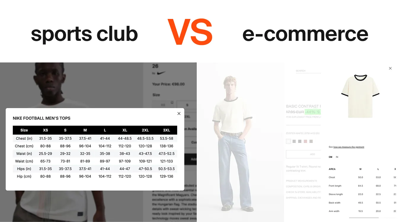
But in many sports club online stores, the experience feels unnecessarily complicated. You open the size guide and suddenly you’re looking at inches while living in Europe, trying to understand measurements that have little to do with the product itself.
At Humbleteam, a UX/UI and product design agency working with sports teams and sports platforms, we see this problem often when reviewing sports e-commerce experiences.
Fans come to a club website with a simple goal: buy merch and support their team. But confusing size tables, unclear measurement instructions, and inconsistent units create friction exactly at the moment when fans are ready to purchase.
Interestingly, other industries solved this years ago.
Fashion brands like Zara design their product pages differently. Size guides allow easy switching between centimeters and inches, clearly explain how to measure yourself, and focus on garment measurements rather than abstract numbers.
The result is simple: fewer questions, less hesitation, and more purchases.
For sports teams building digital platforms and fan engagement ecosystems, the lesson is clear. Good UX/UI design for sports e-commerce doesn’t always require inventing something new. Sometimes it simply means adopting patterns that already work in other industries.
At Humbleteam, we often help sports organizations improve their fan platforms and online stores by identifying small UX issues like this. Because in sports product design, every confusing step in the purchase journey can quietly turn into lost revenue.
And sometimes the difference between selling a shirt and losing a sale is just a clearer size guide.